
I like an ad with an idea.

Targeting Your Practice
This is one example of the beginning of an ad campaign to promote our new app. I also designed the app and its functionality (see the sister ad below). The symbolism here was our poppy logo reimagined for model technology with the flower’s stem as an antibody to target the practitioners' needs. I promise I designed this version of The Oncologist poppy in early 2014 (before the Apple Photo app came out).

Make It Your App
This is the sister ad to “Targeting Your Practice.” In print, it ran on the following page. I also designed the app. One of its best features was that you could customize your feed to filter manuscripts, lectures, and case studies that are of interest to your practice.

We Mean Business
This is a B2B ad to promote advertising in the app. The concept was based around interactive ads that the app supported to help practitioners understand your product to be comfortable prescribing it to patients.

Practice-changing Tool
One of my favorite devices in design is to mix old with new…. mixed media is my favorite art form. This ad is a play at the old house-call doctor tools and modern devices as tools of learning on the go.
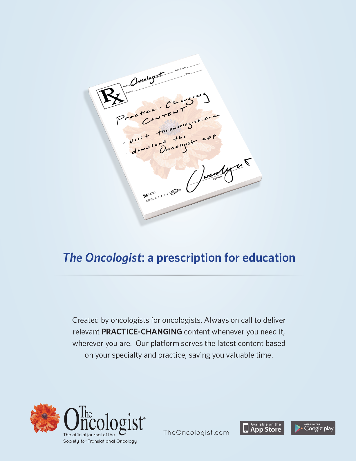
A Prescription for Education
Our journal is created by oncologists for oncologists, so in a sense, it’s one doctor’s prescription to another. This ad campaign also incorporated a physical handout prop of prescription pads that could be handed out to conference attendees. In addition, the pages had instructions to download the app.
Mr. March
This infographic piece was for a wall calendar in MM&M as part of our B2B campaign for advertising on multiple platforms.

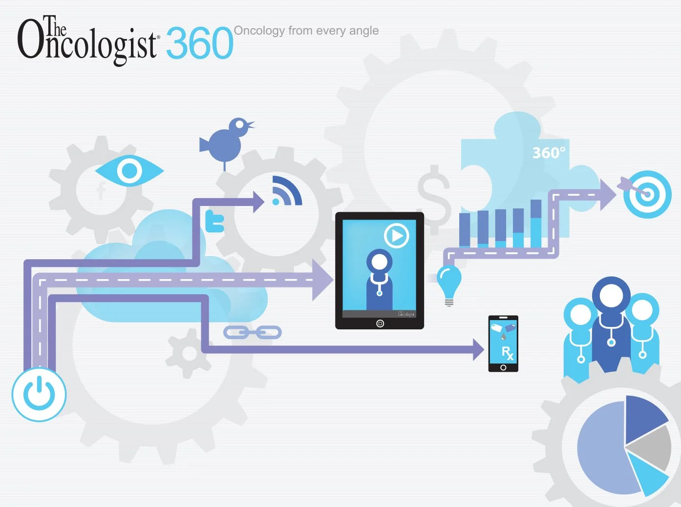
360 Degree Engagement with Oncologists
Hey, word clouds used to be a thing :) This one is handmade. It’s a B2B ad to promote what we can do for advertisers through all our media reach and an array of platforms.